People expect lightning-fast transactions and easy interactions when using ecommerce sites. Provide anything less than this and they’ll simply leave your page without converting.
According to research into average cart abandonment rates from the Baymard Institute, an average of 70.19% of shopping carts are abandoned. This is a high figure. But, there are proven ways to encourage more consumers to convert at the checkout.
Here you’ll discover the main causes of cart abandonment so you understand where the issues lie and you can remedy them. Plus, we’ll share actionable steps, with examples, that you can implement today to improve your cart abandonment rate.
What Causes Cart Abandonment?
Only when you understand why shoppers abandon their carts, can you make informed decisions on how to prevent the roadblocks that stop potential buyers from following through with a purchase.
The Baymard Institute found the following statistics demonstrating the top five common reasons consumers abandon their carts resulting in lost sales for online retailers:
- 47% – Too many added extra costs, e.g. shipping and taxes
- 25% – Forced to create an account with the site
- 24% – Slow delivery times
- 19% – Lack of trust when handing over card details
- 18% – The checkout process is too long and complex
So the time and energy it takes to complete forms during the checkout process is a major turn-off for customers, along with shipping rates, return policy, and security concerns.

4 Steps to Reduce Cart Abandonment
One of the key reasons users abandon their online shopping carts is that they must create an account to check out. They also want to avoid a lengthy, complicated checkout process. But, the truth is you can’t and shouldn’t avoid collecting customer data during the checkout process.
Data-driven businesses and retailers perform better. It’s important you have accurate, rich data on customers for a number of reasons.
When you collect customer information you gain a deeper understanding of the overall demographics of your customer base. This allows you to personalise sales and marketing efforts as well as build long-term customer relationships.
Hopewiser will help you confirm a customer’s address is legitimate and current. When you have the correct location information and purchase histories of your customer base, you’ll also be able to plan ahead in terms of inventory, storage, and shipping.
So you need users to fill out forms to gather rich data. But you don’t want them to abandon their carts because of these forms. Here’s how to improve your checkout process, reduce shopping cart abandonment rate and achieve your guest checkout goals from cart recovery:
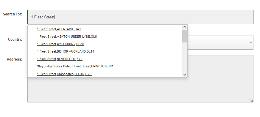
1. Use Smart Autocomplete
A lengthy, complicated checkout process halts consumers in their tracks. Use an autocomplete tool to make the process quicker and easier. Then consumers are more likely to continue with their purchases.

2. Make the Checkout Page User-Friendly
User-friendly design offers a better overall experience to online shoppers. The easier the checkout process, the more likely the customer is to follow through with the transaction. User-experience focused designs help guide the potential customer through the process without them having to think too hard.
First, use a simple call to action, such as “Buy Now” that takes users to the checkout page from the product pages. Quirky brands might be tempted to use more interesting calls to action such as “Get Yours While It’s Hot”. But, in reality, this is more likely to confuse the user than encourage them to click.
Use visual cues to make your on-site checkout flow and easy to navigate. Bold text, buttons, arrows, and other design elements show users where they need to click to move on to the next step of the checkout process (particularly useful on their first time trying).
3. Display Trust Symbols & Social Proof
Modern consumers are tech-savvy. If a site doesn’t seem legitimate they won’t part with their precious card details.
Online shops must comply with Payment Card Industry Data Security Standards (PCI DSS). These are regulations that ensure merchants protect customer card details. Demonstrate on your checkout page that your process meets the standard. This could be a simple badge to show your site is certified.
Similarly, you can demonstrate that your website is well-protected with website security badges. If you use software such as Norton Security or SiteLock to protect data, for example, make that clear to customers with pop-ups or in your faqs.
4. Run A/B Tests
Regular research and testing help you make changes that improve your conversion rate. In many cases, making small tweaks to the layout, copy, and design will lead to more purchases.
To run a successful A/B test, start with a hypothesis. For instance, you may believe the placement of your call to action button impacts conversions.
Then you’ll run an A/B split test with 50% of visitors receiving the original page with the original placement and 50% receiving the new placement. If the latter converts more visitors you can conclude that it’s a more user-friendly placement that you should use moving forward.
When running A/B tests, remember to only change one variable at a time. That way you know definitively, which improvement leads to more transactions.
Final Word
If you want customers to fill in their information and complete a transaction, the process must be quick and simple. When this isn’t the case, e.g. the ecommerce store checkout form is too long and complicated or details such as shipping costs are missing, users abandon their carts.
This is why you need to take steps to make your online store checkout process user-friendly and as fast as possible. This is achieved, for instance, by using autocomplete tools or running A/B tests to find the most user-friendly designs.
As we emphasised, collecting accurate and complete customer data is vital at this step. If you have concerns, ensure customer data is accurate and up-to-date using Hopewiser’s data validation tools.
.


