A long time ago in a digital Eden, the internet was born; nobody really knew what to do with it, and for every idea that worked (Google it), there were far more that didn’t (just Ask Jeeves). Perhaps the greatest idea of all though was the ability to buy something on this internet, and have it delivered to your home – this was the birth of electronic-commerce (soon to be shortened into ecommerce, and eventually just ‘shopping’).
It’s easy to look at the internet today and forget just how far ecommerce has come – and how far it still has to go – with the likes of Amazon and eBay dominating over the high street. With success comes competition (there are close to a million online shops in Europe alone) and with competition comes innovation.
A Brief History of Ecommerce
1994: Netscape develops SSL (Secure Socket Layers) which would become instrumental in protecting shoppers’ data and reassure them it was safe to use their credit cards online.
1995: Both Amazon and eBay sell their first items (a science textbook and a broken laser pen respectively) just months apart.
1998: Google is born; soon it will become the de facto hub of the internet, handling over 3.5 billion searches every day.
2005: Facebook.com launches; in later years it would be at the centre of the ‘social shopping’ phenomena, and recently launched its own online marketplace.
Ecommerce Design Trends
We’ve come a very long way with the look and feel of websites and this couldn’t be truer than the changes seen on shopping sites.
Style
When it comes to style, bigger is better this year – from big bold imagery through to oversized typography, subtle is out and loud is in.
Depth & Shadow
Fresh from the flat design craze, 2018 saw the return of depth and 2019 is continuing that trend – creative use of shadows and parallax scrolling is being combined to make ordinary website elements pop off the screen. This technique is also great for enhancing CTAs and important elements.

Turn Up the Colour
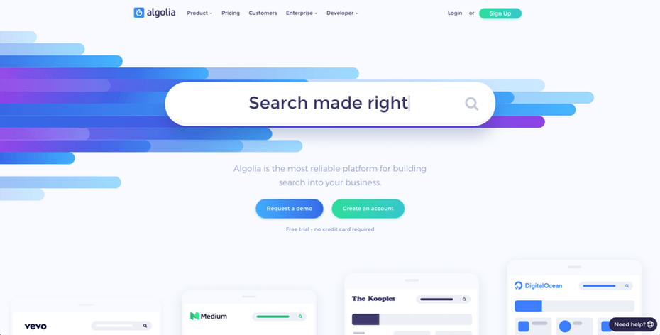
Oversaturation reigns supreme in 2019. Mimicking the look of glossy magazines, website imagery is turning up the saturation in a bid to capture attention. The use of big, bold imagery creates a striking effect, and it’s hard to argue with it from a stylistic point of view.
Make it Move
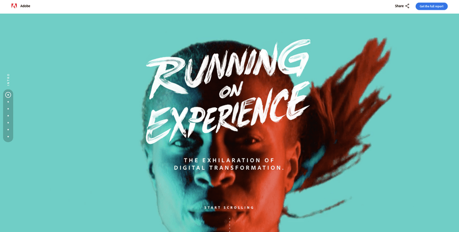
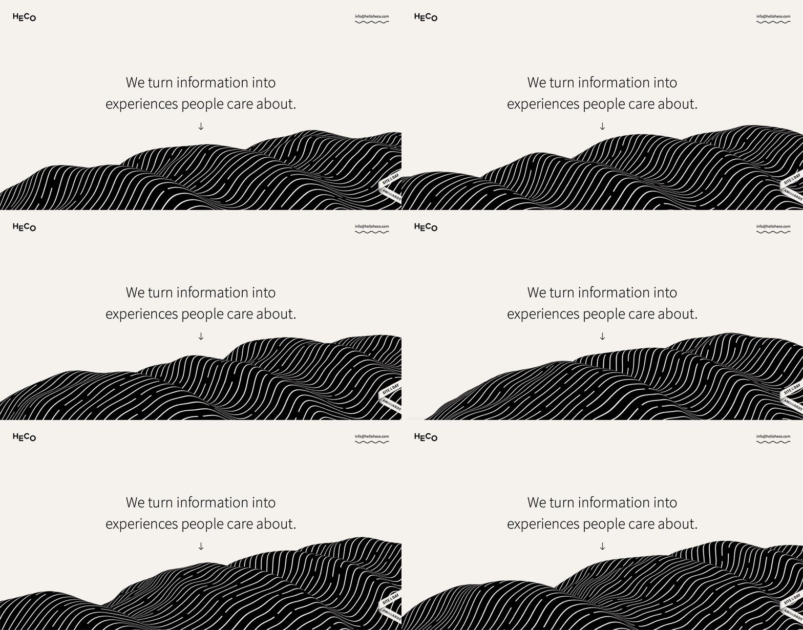
Animated backgrounds are in fashion – especially abstract and particle-based. Powered by JavaScript, they’re a great alternative to video backgrounds, especially if speed and performance is an issue on your site.
Video
Video is a relatively new addition to the essentials list when it comes to websites, but once you see a few headline numbers, it’s obvious why:
71% of marketers say that video converts higher than any other content, and 46% of people say they would seek more information after viewing branded video content; the average website visitor spends 88% longer on a site with video; and having video on your site increases organic search engine traffic by over 157%.
As the internet gets faster and video compression technology gets more advanced, we are seeing more and more video content – that doesn’t slow your site down – being deployed. In 2018 96% of marketers surveyed said they would be investing in video.

Ecommerce Technology Trends
Not as sexy as its design sibling, but arguably the far more important of the two, the technology that powers ecommerce has developed at breakneck pace; ecommerce in 2018 was on the precipice of major breakthroughs that at the time sounded like science fiction, and the ecommerce trends for 2019 are building on this foundation.
Chatbots Lead the Way
Chatbots are a form of artificial intelligence (AI) and are used by businesses to perform all sorts of tasks to help serve their customers. From an ecommerce perspective, brands are using chatbots not only to point out deals and products but also to help customers identify what products they want and need, thus helping businesses to drive sales and revenue.
Through a combination of natural language processing, machine learning and live operators, businesses are providing a higher level of automated communication with their customer base 24/7.
According to a recent Ubisend report:
- One in five (21%) UK consumers would consider purchasing goods and services from a chatbot;
- UK consumers would be willing to spend an average of £314.74;
- 40% of consumers want offers and deals from chatbots.
Chatbots are growing in popularity, being deployed by ecommerce brands to messaging platforms such as Facebook Messenger, Skype and Slack.
Annual worldwide AI revenue is projected to grow from $643.7 million in 2016 to $36.8 billion by 2025.
Reality, Enhanced: The Rise of AR
While VR (Virtual Reality) is preoccupied with letting people escape the mundanity of planet earth, AR (Augmented Reality) is more interested in making the real world more exciting, or at the very least, more functionable.
As the vast majority of people have become familiar with AR from the recent trend of chasing pocket monsters with phones, brands have quietly been investing serious time and money into the AR scene.
Ikea’s app allows you to browse their catalogue on your phone and – if you have a compatible device – see the item in your home in real time, using your phone camera, thus ending the question ‘will this table go with the sofa’ forever.

In order to integrate AR successfully, retailers must consider the needs of the customer. Does it enhance their shopping experience and provide value? Ultimately AR should meet the goals of the business and help to increase sales and revenue.
Points to consider when using AR:
- Offer a useful user experience. AR shouldn’t be just a novelty gimmick, AR should give the customer added value and an enhanced shopping experience;
- Incorporating AR is an immediate way for retailers to stand out from the pack by blending online with off; turning those undecided browsers into paying customers;
- Allow users to customise and interact with the product virtually. By offering a fully personalised shopping experience for each user, customers can interact with the product and get an enlightened sense of customer service;
- If your AR shopping experience can finally remove uncertainty from the buying process then the rewards will be huge.
Alexa, Tell Me About Voice Assistants
You may have heard of them – they have offbeat names like Alexa, Siri, Cortana and… Google Assistant. Following in HAL 9000’s footsteps, the new voice assistants are slowly taking over – 50% of all online searches are predicted to be carried out by a voice assistant by 2020; by the end of 2019, voice assistants are projected to be a $600 million industry, with online sales carried out by voice assistants topping £3.5 billion by 2022.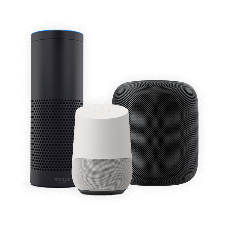
Amazon Echo (which houses Alexa) is currently the market leader, which puts it in good stead to capitalise on the incoming growth of voice assisted online shopping.
Before you run off to start prepping your site for voice search, consider that not every product is appropriate – most active shoppers using voice assistants tend to purchase lower value items, and especially repeat items: household goods and entertainment products are the top sellers, along with food and electronics.
What is Blockchain?
Blockchain technology was originally developed for digital currency Bitcoin that enables digital information to be distributed, but not copied. With the growth of online sales, some common problems have started to emerge such as payment issues, problems with supply chain management and transparency, data security breaches, satisfied retailers, efficient management systems, and consumer satisfaction. Blockchain can be used to resolve some of these issues facing ecommerce platforms.
The ways in which blockchain can help the ecommerce sector are:
- Supply chain management. Blockchain can create an incorruptible transparent supply chain solution resolving many supply chain management problems. This will also help to increase customer confidence as users will be able to see the order flow of the products they purchase.
- Tighten up data security. Ecommerce platforms usually store customer data on centralised servers which is susceptible to cyber attacks. With a blockchain based ecommerce platform, customer data is decentralised making it almost impossible to hack.
- Customer payments. The current payment industry still has a few issues, such as high payment processing fees, and the high charges from ecommerce platforms (usually around 2-3% of sale). Blockchain technology will be utilised to help reduce the cost of the financial transaction, increase security and improve the payment experience for customers.
Emails Get Interactive
Emails may not be new to ecommerce (not by a long shot) but some enterprising brands are finding new ways to use email. Email marketing is one of the cheapest and most effective forms of marketing (though some brands are still struggling with how to engage customers post-GDPR) so it is no surprise that they are making a comeback.
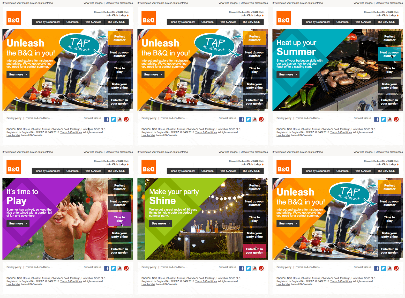
Currently being trialled by several brands are interactive emails, which allow recipients to see more information about a product, as well as make a purchase, all within the email window itself. Repeat customers who have online accounts can now be targeted with specific email campaigns encouraging them to buy direct from the email, using their existing details, which would appear to them as a one-click buying experience.
Ask The Experts
We gathered a few experts in the ecommerce sector to discuss all things ecommerce trends.
Choosing a Style When Designing an Ecommerce Site
How do you decide which style to use when designing an ecommerce site, and how do you keep abreast of new developments?
Kit Hargreaves, Creative Director, Klickntap:
With ecommerce we try to combine user expectation with individual design – i.e. making sure the site looks and feels like an ecommerce site, but with unique traits that provide the user with that ‘oooh’ factor.
As for keeping abreast of ecommerce design trends: Research, pure and simple – it’s about looking at the latest websites that are being created, and seeing what some of the larger companies are doing with theirs. They’ve invested huge amounts of money in researching user journeys so it’s silly to ignore it.
Alex Taylor, Web Designer, Create 8:
If we haven’t designed the brand identity initially, to get an idea on style, we usually bring our clients in to the studio for a discovery meeting to get in touch with how their business runs day-to-day. During the discovery phase we like to get everyone’s ideas out of their minds and onto our whiteboards. Once the ideas are out there we like to develop an understanding with the client of how the site should flow and interact with the customer. This usually directly translates into the style and navigation of their website, for example whether it’s a quirky and fun business or professional and slick – this should always be reflected in the design of the website.
To keep involved with the trends of the industry, we are always speaking to friends within the design world as well as collaborating and constantly looking at blog posts from other agencies, freelancers and large media industries. Every year, and even every month there are new styles available, our designers work heavily in their own time and in the studio to ensure we are always up to date.
Chris Buckley, Founder, Pixel Kicks:
We have a set of best practice checkpoints that we reference for every website we produce, as well as taking into account certain preferences shown by the client, as well our own personal spin.
On an annual basis we have team meetings where we assess new trends and developments, as well as old methods that become redundant.
Neil Thomas, Managing Director, Finley Design:
Purely down to the client’s industry sector and target audience, understanding how the target customer works is key to getting the right design.
Research and more research, the industry is huge, and trends are constantly changing, being involved in forums and listening to client feedback is key.
Angela Roche, Creative Director, Design By Day:
The same as with any site. By taking into account the brand / business, the target audience and the aims and objectives of the client.
We keep up with Medium, Dribbble, WooCommerce Blog, TechCrunch, Smashing Magazine for the latest design trends.
Craig Greenup, Managing Director, Radical Web Design:
It depends on many factors – the industry, number of products, target audience and product photos can make a real difference for our approach. We like to explore new possibilities and always want to deliver functional and eye catching designs. When products are attractive and well photographed, it certainly adds an extra effect.
We’re always up to date with all the influential design showcases and never miss an opportunity to attend design meetups and workshops.
Jamie Allsop, Senior Web Designer, POD Digital:
When deciding on a style for an ecommerce store we take into account what the store will be selling, who they will be selling to (the target market) and what the company stands for (their story and background).
When looking into trends it’s important to make sure that we provide the customer with a design style that will stand up against time and the various trends that come and go. It’s important to always focus on what will be popular in the future rather than something that is popular now.
Challenges When Designing an Ecommerce Site
Are there any challenges that are unique to designing an ecommerce site?
Kit Hargreaves, Creative Director, Klickntap:
There are plenty of places for the user to become disinterested and leave, plus you are actually asking users to part with money, so they become far more discerning. Especially when it comes to security.
Alex Taylor, Web Designer, Create 8:
There are many challenges throughout creating an ecommerce website. One of the larger challenges is creating a backend to the website (the side where you can manage products) that the client can truly use day-to-day. As this may be their only way to sell their products, we always make sure to run CMS (content management system) workshops, as well as guides for each client – personalised to their experience. From a design side, it’s making sure the customer’s journey through the website is as easy as possible, with some websites even explaining what the company do can be difficult. But with team discussions and planning, we eventually find a way.
Chris Buckley, Founder, Pixel Kicks:
People expect an ecommerce website to have common traits, so when looking to produce a custom design, you sometimes have to rein in any instinctive design ideas that might be unique, but might not necessarily improve the whole user experience (UX).
Neil Thomas, Managing Director, Finley Design:
Making sites unique in design can be tough sometimes, when in ecommerce many aspects of the site have become standardised over years, for ease of navigation, so the cart is often in the same position, sidebars are the same, functions repeat, etc. so we have to look at how to provide engaging and unique design concepts.
Angela Roche, Creative Director, Design By Day:
Getting the balance right between injecting brand identity into designs without overshadowing product imagery.
Craig Greenup, Managing Director, Radical Web Design:
User experience (UX) is a key challenge, particularly with an older target audience who may not be as tech-savvy. Therefore we have to ensure that all functional aspects are simple to use and hassle-free for users. This may result in dropping elements of the website that are not essential, just to eliminate any possible confusion.
Jamie Allsop, Senior Web Designer, POD Digital:
One of the challenges to designing an ecommerce store is you have to create something that is not only visually pleasing for a user but something that functions and pushes products to the customer. You have to think more about how the UX of the site may affect a user’s experience rather than just aesthetic appeal.
Best Designed Ecommerce Sites
What do you consider to be the best designed ecommerce site (not one of your own)?
Kit Hargreaves, Creative Director, Klickntap:
I’ll get shouted at for this one, but I still think that Apple’s shop site has one of the most fluid experiences in the world. Although any site that adopts simple methods of pay, such as Apple or Android Pay, are all the best in my book.
Alex Taylor, Web Designer, Create 8:
A great example of an ecommerce website that has an easy buying process would be: www.willowandhall.co.uk. The website step-by-step guide is easy to use, quick and also you have the ability to order samples of the materials along with the process.
Chris Buckley, Founder, Pixel Kicks:
www.firebox.com.
Neil Thomas, Managing Director, Finley Design:
www.sideshowtoy.com.
Angela Roche, Creative Director, Design By Day:
I’m in love with this site at the minute: www.mowellens.com.
Craig Greenup, Managing Director, Radical Web Design:
There are so many great websites out there, if we had to pick one we would choose the Nike Store. It is easy to use, information is presented in a clear way and it is packed with beautiful photos.
Jamie Allsop, Senior Web Designer, POD Digital:
I find it hard to choose which I think is the best as there are so many good sites out there. But I find ASOS’s website to be one of the best ecommerce sites out there because of how clear and simple the site is to use. They haven’t created a site that is just purely about aesthetics. They have something that not only functions for a wide target market but performs effortlessly.
Essential Functionality for Ecommerce Sites
What functionality would you consider to be essential to all ecommerce sites?
Kit Hargreaves, Creative Director, Klickntap:
Intelligent Search.
Alex Taylor, Web Designer, Create 8:
In short, a simple ordering process. Always make sure the customer can get from seeing the product to buying the product in the least amount of steps.
Chris Buckley, Founder, Pixel Kicks:
Loading speed and a simple checkout.
Neil Thomas, Managing Director, Finley Design:
Navigation, if your customers can’t find the product they want, you may as well give up.
Angela Roche, Creative Director, Design By Day:
The ‘Add to Cart’ button!
Craig Greenup, Managing Director, Radical Web Design:
A quick and easy to understand checkout procedure is essential to all ecommerce websites. Which should be supported by advanced search functionality and flexible filters to help customers easily find what they are looking to purchase.
Jamie Allsop, Senior Web Designer, POD Digital:
Nice, clear and simple checkout with clear delivery and payment options.
Game Changers
What’s the biggest game changer you’ve seen in ecommerce functionality?
Kit Hargreaves, Creative Director, Klickntap:
Automated chatbots guiding you to the product you need.
Alex Taylor, Web Designer, Create 8:
Although AI in ecommerce is still getting started, I think using it to answer customers’ questions and direct them to the products they want to buy is going to be big.
Chris Buckley, Founder, Pixel Kicks:
Chatbots that can help give a customer quick & helpful responses.
Neil Thomas, Managing Director, Finley Design:
Abandoned cart has really been an eye opener, one of our clients generates more business from this module alone than from standard sales.
Angela Roche, Creative Director, Design By Day:
Enabling customers to visually customise products to their requirements.
Craig Greenup, Managing Director, Radical Web Design:
Vue Storefront [https://github.com/DivanteLtd/vue-storefront] that takes ecommerce websites to a whole new level using progressive web application technology. The main benefits are centered around performance, as there are no reloads and all interactions are immediate. The application works really well with slow internet connections and even works offline which is ground-breaking – as customers can still browse products as normal.
Jamie Allsop, Senior Web Designer, POD Digital:
From when I started developing websites about ten years ago, the ecommerce platforms themselves have become much more powerful with added emphasis on the end-user. Updates have run parallel to what search engines are expecting to see from websites, which improves user experience and ultimately conversion.
Exciting Developments
What changes are being developed that have you excited?
Kit Hargreaves, Creative Director, Klickntap:
Anything to do with increasing simplicity by providing more user interaction at the outset, such as AI.
Alex Taylor, Web Designer, Create 8:
Going back to my previous answer, I think AI will have a big part to play in future ecommerce websites. Also speaking of AI, I think augmented reality on our smartphones will definitely be coming to the shop experience. I’ve seen many apps that offer this experience for products – but nothing yet that goes through to purchase.
Chris Buckley, Founder, Pixel Kicks:
Easier checkouts that use Android Pay, Apple Pay etc. In my opinion most website checkouts are still too cumbersome and slow.
Neil Thomas, Managing Director, Finley Design:
I think the increase in media interaction and product display is making ecommerce more exciting, the ability has often been there but interaction with customers gets better year on year.
Angela Roche, Creative Director, Design By Day:
Chatbots & AI.
Craig Greenup, Managing Director, Radical Web Design:
Chatbots! Just think, instead of browsing a website you can tell the chatbot what you are looking for and be provided with what you need. Just like walking into a physical store and talking to an employee. An added benefit is being able to keep customers informed about the delivery/status of their order directly through Facebook Messenger. It will be interesting to see how many companies adopt this functionality and how far the trend continues.
Jamie Allsop, Senior Web Designer, POD Digital:
The online marketing game as a whole has me really excited. We’re entering an era where website development and design are no longer separate from SEO, user experience, conversion and video marketing. It’s a really exciting space to be in at the moment and it means that specialists will be able to add a few more strings to their bow.
The Unsung Hero
Finally, what’s the unsung hero of ecommerce site functionality?
Kit Hargreaves, Creative Director, Klickntap:
Simple mobile payment solutions.
Alex Taylor, Web Designer, Create 8:
Login via Facebook, or all popular social media platforms. It’s a great way to ensure those important customers don’t navigate away from your site – especially if they are hit with a daunting signup process.
Chris Buckley, Founder, Pixel Kicks:
Large & appealing photography. Go big!
Neil Thomas, Managing Director, Finley Design:
Not ecommerce solely, but the live chat is underused, to have that there-and-then contact direct clients is a great way to get your sales staff to target customers while they’re browsing, it’s the modern day digital version of the “can I help you?”
Angela Roche, Creative Director, Design By Day:
Shipping – at least from the customer POV!
Craig Greenup, Managing Director, Radical Web Design:
Everything that’s related to customer service processes that can be efficiently automated. Such as generating invoices, synchronising warehouse status for order fulfilment purposes, shipping labels and automating communication processes.
Jamie Allsop, Senior Web Designer, POD Digital:
The auto complete search function. So many people use one of these yet they are not screamed about. I find the function so useful it not only helps the user find what they are looking for by typing only a few letters, but it also gives you the opportunity to provide keywords that are related to what the user has typed in, allowing you to broaden the users search range.
Many thanks to our panel of experts, who gave their time as well as their opinions on all things ecommerce! They also provided us with a few examples of their work, which you can see below in the gallery.
Keep up With the Latest Trends
Here at Hopewiser we pride ourselves on our expertise, based on our long history of working with digital agencies and website developers. Hopewiser help ecommerce sites to be more efficient with Address Lookup software and Data Cleansing solutions. If you’d like to stay up to date with the latest developments in addressing technology, sign up to our newsletter by emailing marketing@hopewiser.com.
, updated 21st February 2023.


